Designing my wedding
How often do I get the opportunity to be my own designer and client?
For my 2021 wedding, I dove into designing all our print materials as a way to de-stress from the pressure of planning a COVID-era event.
It worked, I had a lot of fun doing it — and I think that sense of joy and celebration came through.
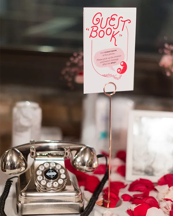
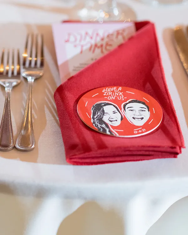
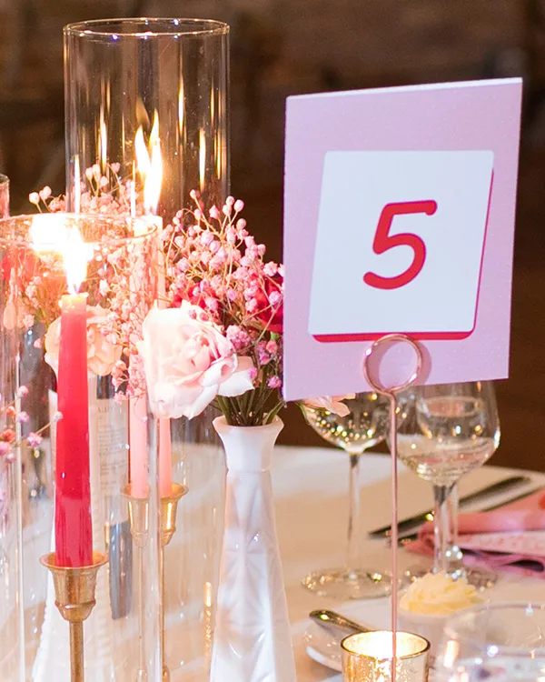
Color scheme
Since the event (eventually) became a winter wedding, we wanted something warm and festive for the color scheme.
And that was step one, since it also involved decisions other folks needed to know: the caterers (napkins, candles), our wonderful florist, and so on.
We quickly arrived at a two-color palette of jewel-tone red and pale pink, perfect to accent the greenery our florist was bringing to the table.
C0 M100 Y100 K0 C0 M125 Y6 K0
I don’t recall any runner-up ideas here, and I can’t imagine having gone in another direction. It was roasting chestnuts, it was huddling under a blanket, it was our wedding.
Type
One thing I was certain of from the start: we weren't going to use any flowy, script-y wedding fonts. I have nothing against them, but when you’re 32 and have been to many years of other beautiful weddings, you know what you like and what you don’t.
We went looking for something more modern and more fun.
Our primary typeface was a (heavily modified) Chippewa Falls, which has these casually beautiful, friendly letterforms for the capitals — but, importantly, is much less formal than your typical wedding calligraphy.
I'm certain the capitals weren't designed to be used all together, but I wanted to make it happen. That required some judicious modifications of letters so they'd fit together nicely. I also added just a little weight to make things feel cozier:

Shaping the letters to our needs often meant designing new lowercase versions of O and E, shifting the baseline for specific letters, or sometimes joining letters into new custom ligatures.
The body text was a more readable Abril Text. I really like the small caps, which lent a little more credibility to the really serious things like the ceremony program and, um, the menus:
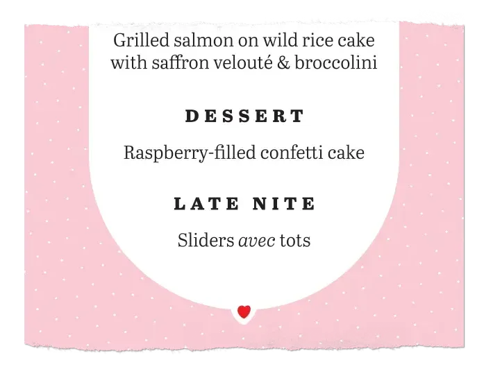
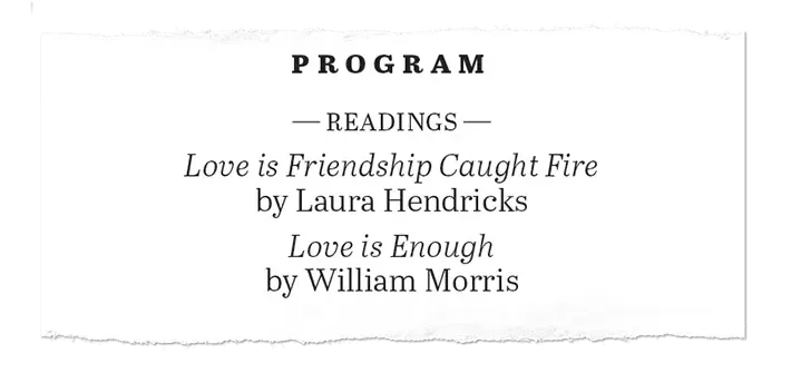
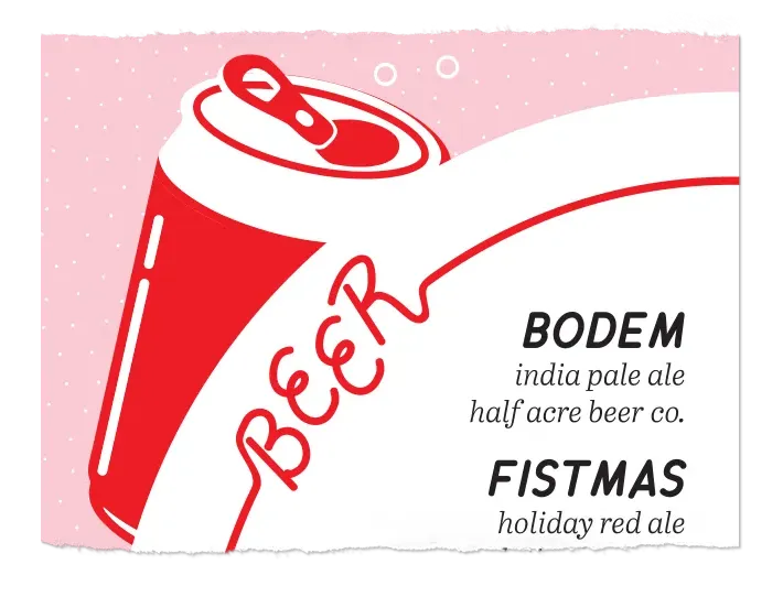
You can also see examples of the Chippewa Falls lowercase letters in BODEM in the last example. (If you are ever in Chicago, I highly recommend Half Acre.)
Delivery
Different files had different destinies:
- Foamcore for the easel-bound posters, like the welcome sign or bar menu
- Cardstock for any handouts like programs, dinner menus, and drink coasters
- Office paper for simple, non-handheld items like table numbers
From there, we had some minimal trimming to do at home, before handing off everything to our wedding planner and venue, trusting they would make it look beautiful. Which they did, of course.
Files
View some of the final print files as PDFs: