“Botanikal Brewing” brand identity
This is one of three quick brand identities I put together based on misspelled words. The other two are Slumbre and Froot Punch. For these three projects, I looked for inspiration from typefaces I like, books of vintage type, or specific words I encounter. Instead of following a typical brand development process, I started with a wordmark (a logo using just text) before deciding what the brand does, then created mockups of their work, and finally codified what I discovered in a summarized brand guidelines infographic. It was a quick way to make up some cool (fake) brands, while developing my skills in working quickly and intuitively in multiple styles.
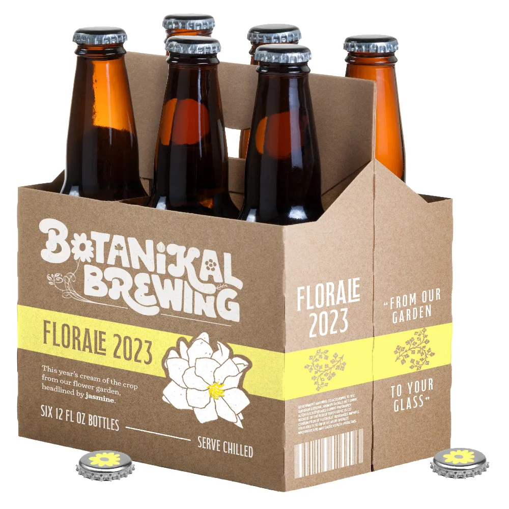
The weekend I created “Botanikal Brewing,” I knew I wanted to do a beer company, since I've always thought the industry was ripe with beautiful merch design opportunities: not just the cans and bottles, but also buttons, hats, glasses, stickers, and koozies.
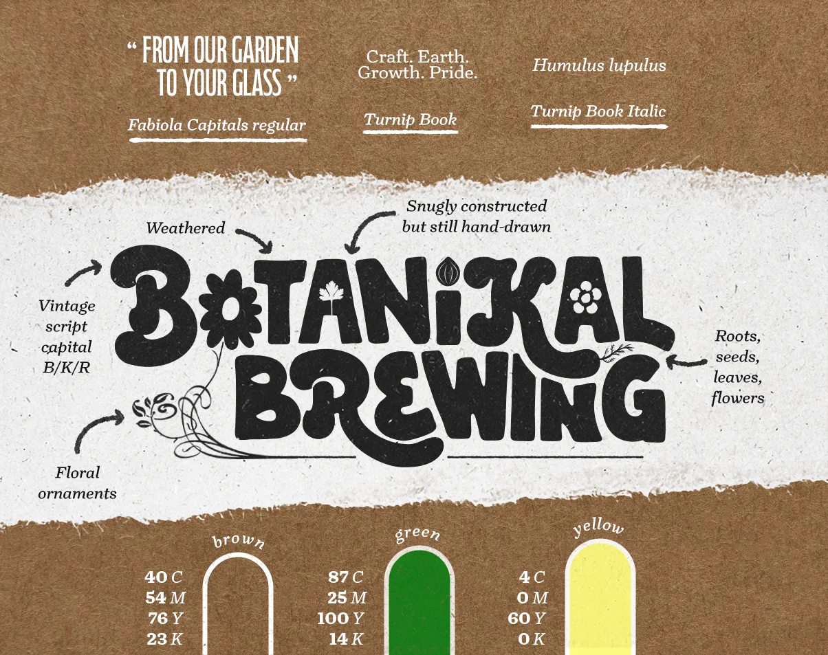
I was also reading Vintage Type and Graphics from the library, which included (to my delight) a real-life CD-ROM with some scans from the book. As you can see below, I was struck by three Herkules capitals (B, K, and R) from Berthold, designed in 1899 and right at home in a fake beer label from 2023.

That book also yielded some vintage ornaments and floral elements that inspired bits and pieces of the designs below.

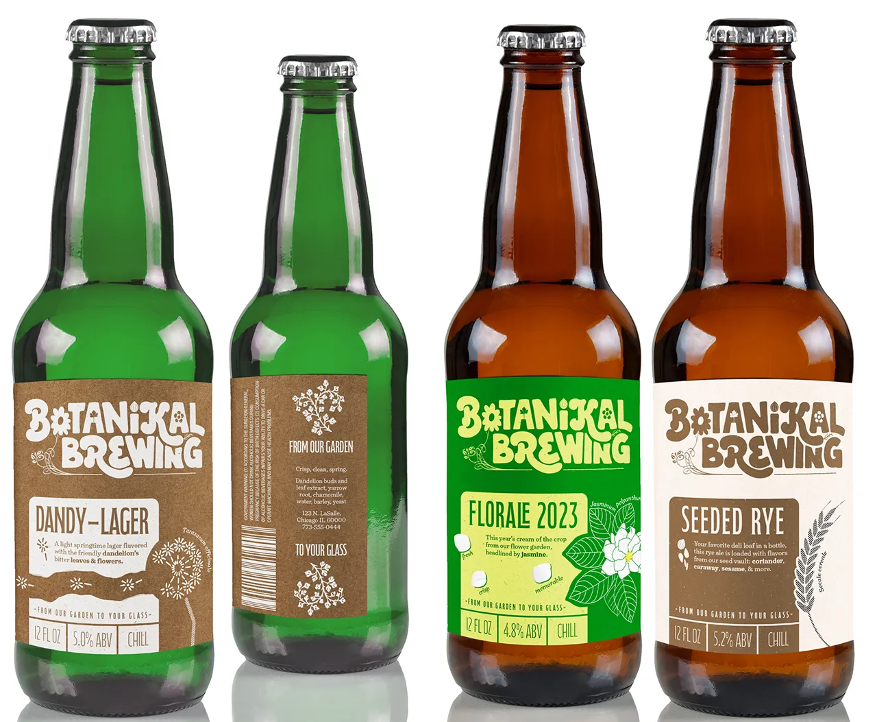
After the wordmark logo came the fun part, namely making up beer names based on what I thought a “Botanikal Brewing” might sell. (Personally, I'm a sucker for anything on a menu that says “floral notes.”) This involved some shuffling around my spice cabinet and googling what flowers are edible.

(See a larger version.) Early (ancient) beers didn't use hops, but there are lots of other flowers that can add bitterness, like dandelions. Each label here has a star ingredient spotlighted with its scientific name to highlight the botany connection. (And as much as I'd like to take credit for the little “LE” glyph, that was already part of the Fabiola Capitals font and I demanded on shoehorning it into the Florale name.)
Botanikal Brewing / brand guide

(See a larger version.) For the wordmark logo, I had a lot of fun fitting those Herkules capitals snugly into the other letters (a modified and suitably vintage-ish Wasted Willie by Mighty Short). Then I threw in lots of botanical elements, including some vintage floral ornaments and hand-drawn flowers, seeds, roots, and herbs. I know what you're asking, and the answer is: I picked the Turnip font half for its name and half for its looks.
Botanikal Brewing / next steps
If I were to spend more time on this, my number one goal would be to partner with some illustrators for specific labels. I think my labels here work but don't scream "bounty" the way I wanted. Some lush, oversized, full-bleed botanical illustrations could really sell these beers.
Since these assets are firmly in the physical realm, I'd also want to dive into more details about the print process. Is this craft paper-esque stock even available at the price point a brewery needs? What are the Pantone values for these brand colors? These questions are beyond the scope of this little exercise, but good to think about.
Finally, I'd be interested in exploring a stand-alone pictorial mark, like the little flower on the bottlecaps above. Does that work for a not-yet-established brand, or does it need to be something like the capital B, or a combination?