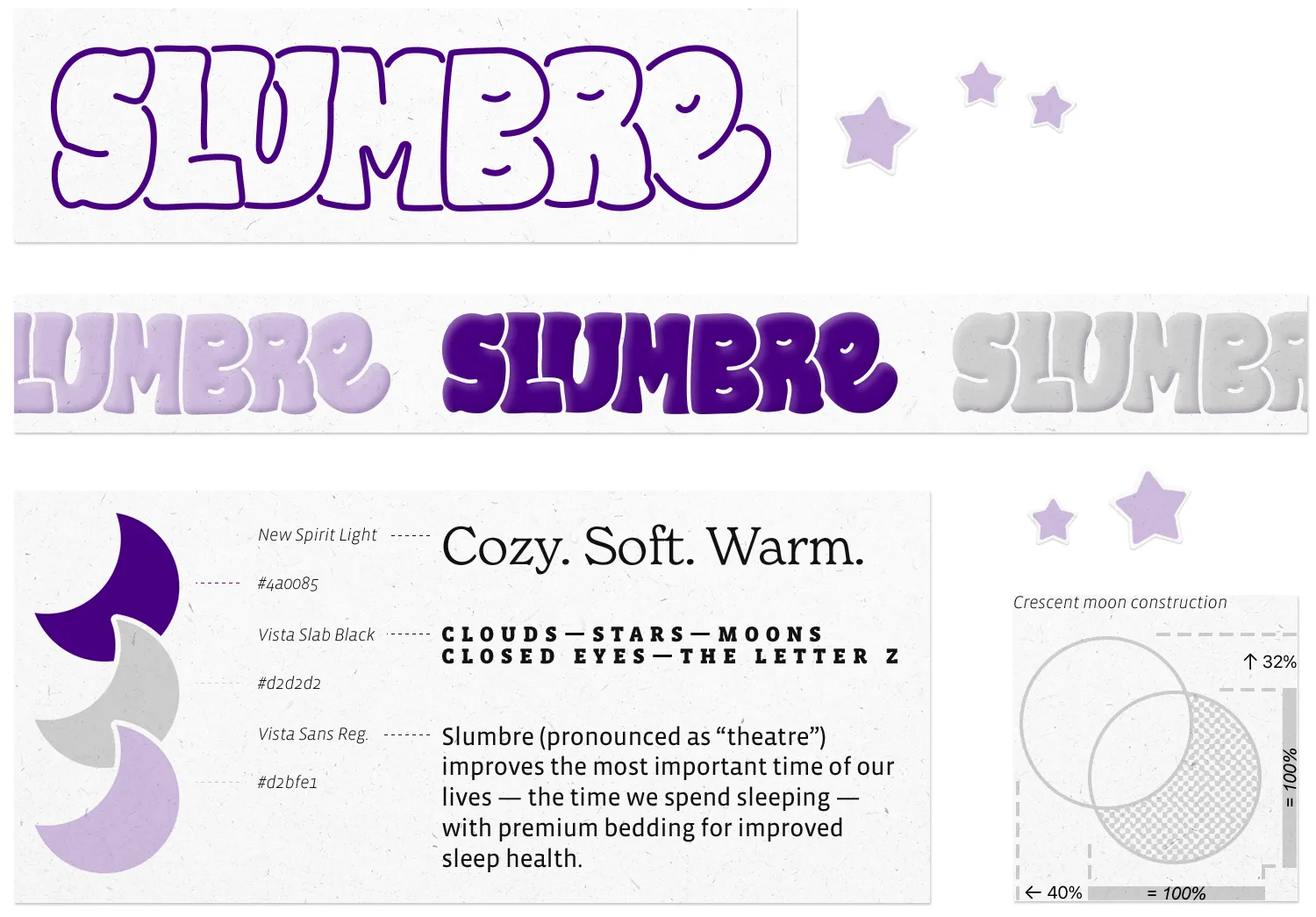
“Slumbre” brand identity
This is one of three quick brand identities I put together based on misspelled words. The other two are Botanikal Brewing and Froot Punch. For these three projects, I looked for inspiration from typefaces I like, books of vintage type, or specific words I encounter. Instead of following a typical brand development process, I started with a wordmark (a logo using just text) before deciding what the brand does, then created mockups of their work, and finally codified what I discovered in a summarized brand guidelines infographic. It was a quick way to make up some cool (fake) brands, while developing my skills in working quickly and intuitively in multiple styles.
In Slumbre's case, spelling it like “theatre” both fit my project parameters and gave the little “e” somewhere to rest its head.

It seemed like Slumbre must sell some premium pillows, comforters, eye masks, and the like. So violet and lavender were obvious choices for this bedding brand. You can just hear them being advertised on a podcast, can't you? Draft ad copy: “That's Slumbre, spelled the fancy way: S-L, U-M, B-R-E!”
The letters in the wordmark above are hand-drawn, with adjustments in Illustrator. Theses animations were prototyped in Figma before being fleshed out in After Effects:
Since I conceived these animations as digital ad assets for the sleepy and impulsive, I mocked them up as above — but see Cozy Mode and Drift Off for the full-resolution animations by themselves. (There is no audio in these videos.)
Slumbre / brand guide

(See a larger version.) For the Slumbre name itself, I'd envisioned letters sort of falling into each other, too sleepy to stand up, and of course with the little sleepy eyes in the B, R, and E. I wasn't able to find a suitably puffy font out there, so I drew it myself, then made adjustments in Illustrator.
Slumbre / next steps
If I were to spend more time on this, I'd like to flesh out some of the iconography, like defining how to use the moon shape, how and where to use the stars and the sleepy eye shapes, and so forth. I'd also want some product photography if we really want those Instagram ads to convert.