“Froot Punch” brand identity
This is one of three quick brand identities I put together based on misspelled words. The other two are Botanikal Brewing and Froot Punch. For these three projects, I looked for inspiration from typefaces I like, books of vintage type, or specific words I encounter. Instead of following a typical brand development process, I started with a wordmark (a logo using just text) before deciding what the brand does, then created mockups of their work, and finally codified what I discovered in a summarized brand guidelines infographic. It was a quick way to make up some cool (fake) brands, while developing my skills in working quickly and intuitively in multiple styles.
I decided “Froot Punch” obviously needed to be a dessert brand, along with cooler bags for frozen treats and takeout containers for pies and tarts.

The letters in this wordmark started as New Hero Super, slightly stretched. I hand-drew (on paper and then touched up in Photoshop) the citrus slices, pineapple, and drop shapes.
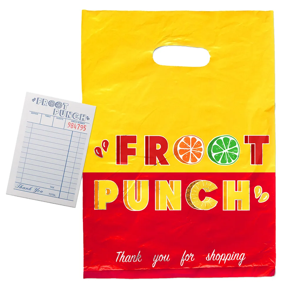
Honestly, I think the colors mostly drove this one. Once the juicy red and yellow were settled, the accent colors, imagery, and even the concept for this insulated takeout bag leapt from there:

(See a larger version.) This insulated bag keeps popsicles frozen on the way home, while catching the eyes of passersby.
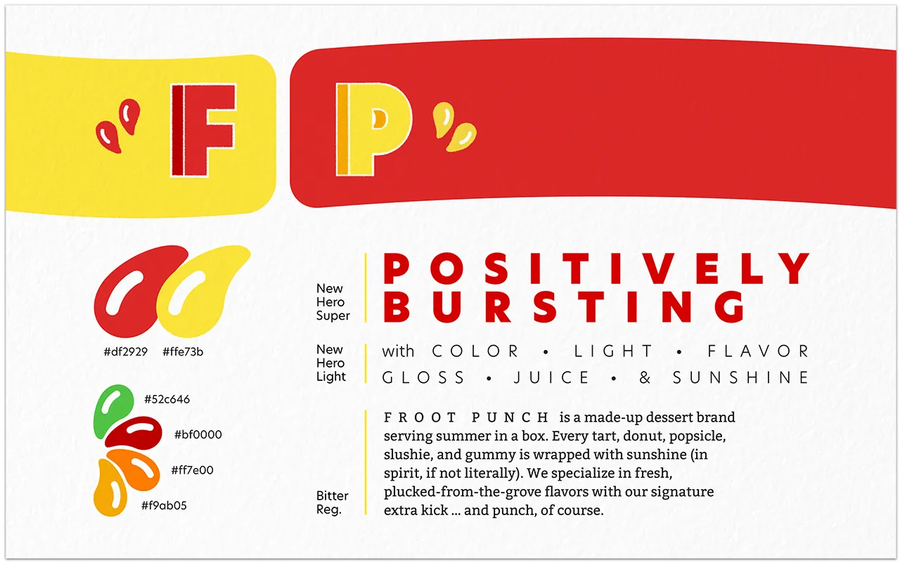
Froot Punch / brand guide

(See a larger version.) This brand leans heavily on the “juice drop” iconography seen in the brand guide. It also relies on a wider-than-usual supporting cast of accent colors, with deeper versions of the red and yellow for shading purposes, and of course green and orange to round out all the tropical-fruit needs.

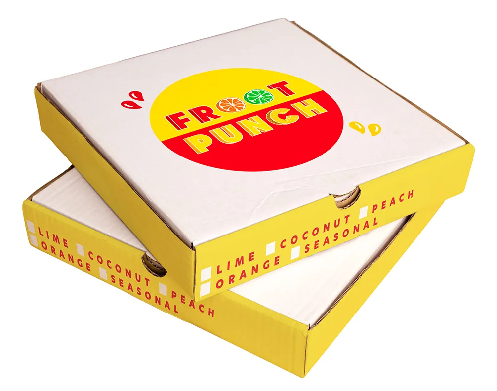
(See a larger version.) Is that pizza in there? Nope! It's a freshly baked fruit tart headed home with a trendy consumer.
Froot Punch / next steps
If I were to spend more time on this, the next obvious step is more digital assets. Froot Punch would need a robust online storefront for placing orders, and I can already see some ways the color scheme and “drop” icons would lend themselves to compelling web designs and social media ads.
And, as with “Slumbre,” if this were a real business, I'd want some product photography of the goods in question. Much more enticing than bags and boxes.